The Bindery, Farringdon
Dorrington
The Bindery | Dorrington
Get your business
Farringdon bound
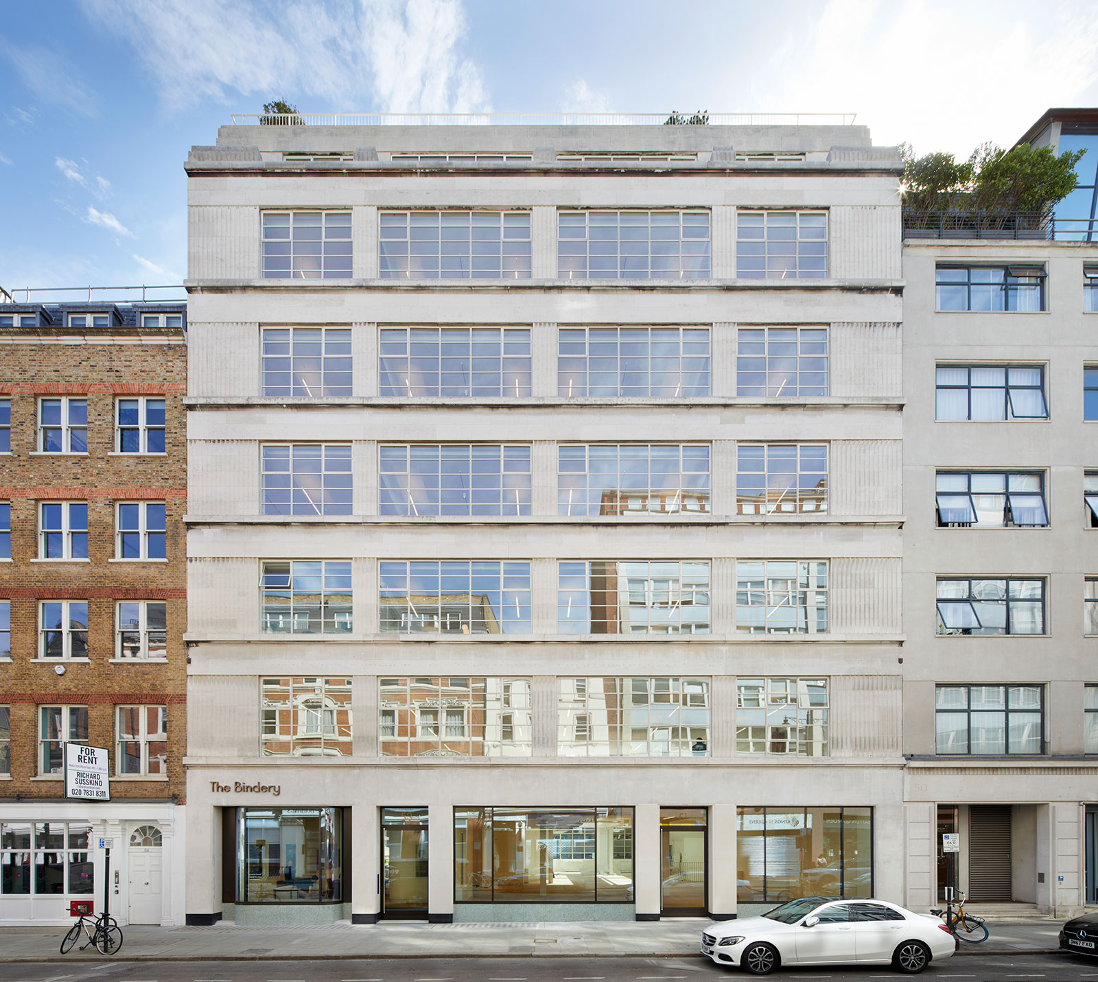
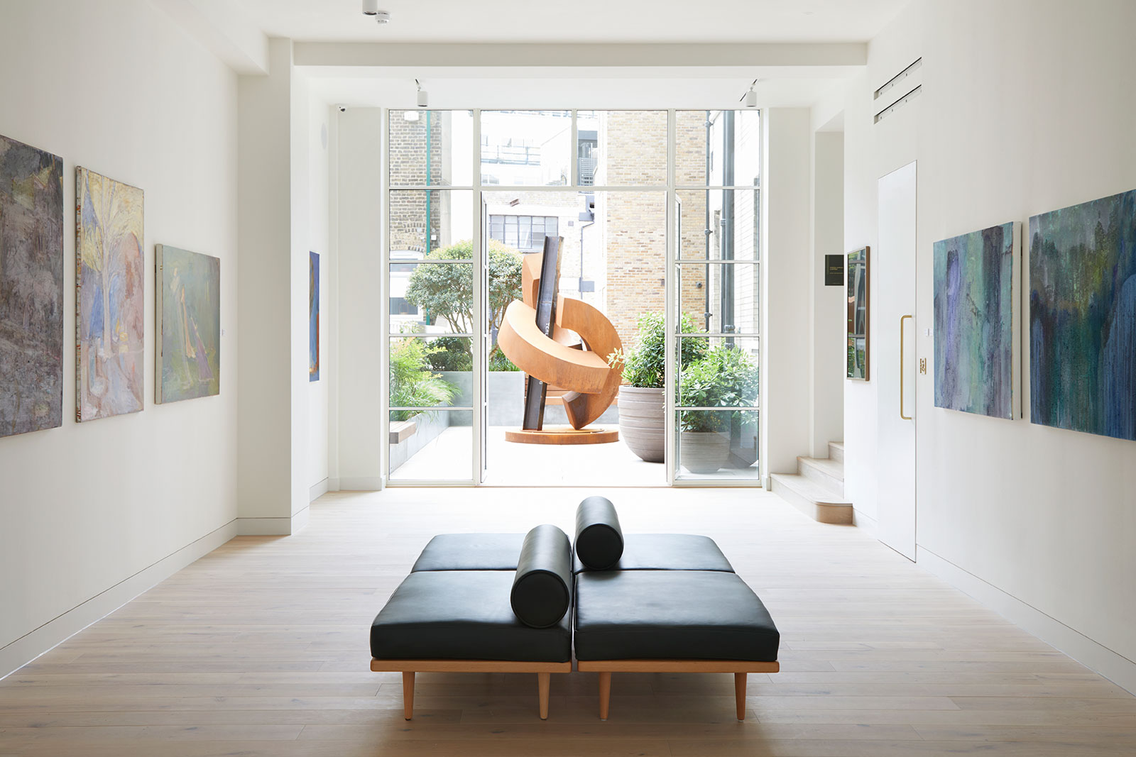
Within an Art Deco building of the 1930s set on Hatton Garden, Dorrington PLC and the architects Piercy & Company created an exemplary office building.
Highlighting the classic building features whilst creating flawless levels of attention to detail on the finish- this one was bound for greatness.
For this project we were asked to name and create a brand for the building, as well as working on placemaking within thriving Farringdon.
Delving deep into the building’s heritage we discovered it was built on the site of a once thriving bookbinder. This research heavily influenced our chosen name; The Bindery. In fact, the eventual occupier (a world renowned publisher) was first intrigued by the space because of that name.
Concept
Campaign
Branding
Digital
Copy
Art
Environmental
Merchandise
Product Design
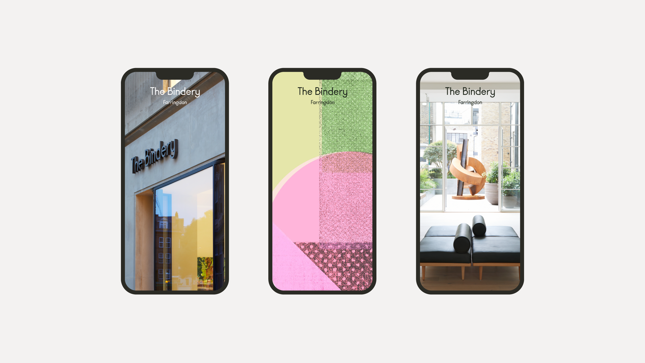

Our Film
Turn the sound on for this one. We always try to mix things up with an unusual soundtrack. It gives a moving piece a completely different kind of flavour.
Turn the sound on for this one. We always try to mix things up with an unusual soundtrack. It gives a moving piece a completely different kind of flavour.
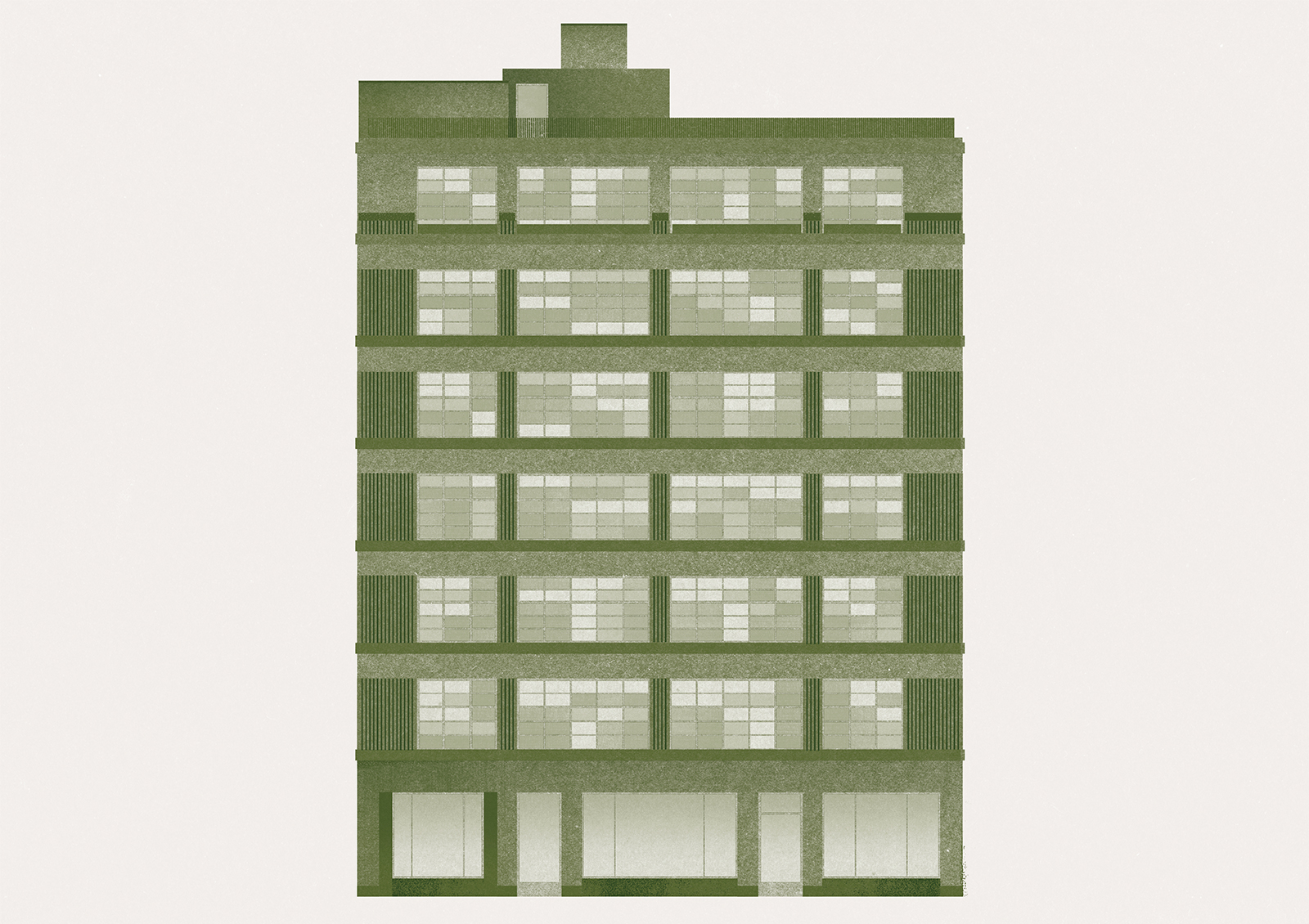
The Illustration
Typeface & Brand
Unique, standout yet in-line with the buildings past, present and future.
A modern take on a classic deco cut, with some stunning feature characters.
Unique, standout yet in-line with the buildings past, present and future.
A modern take on a classic deco cut, with some stunning feature characters.
Product design & signage
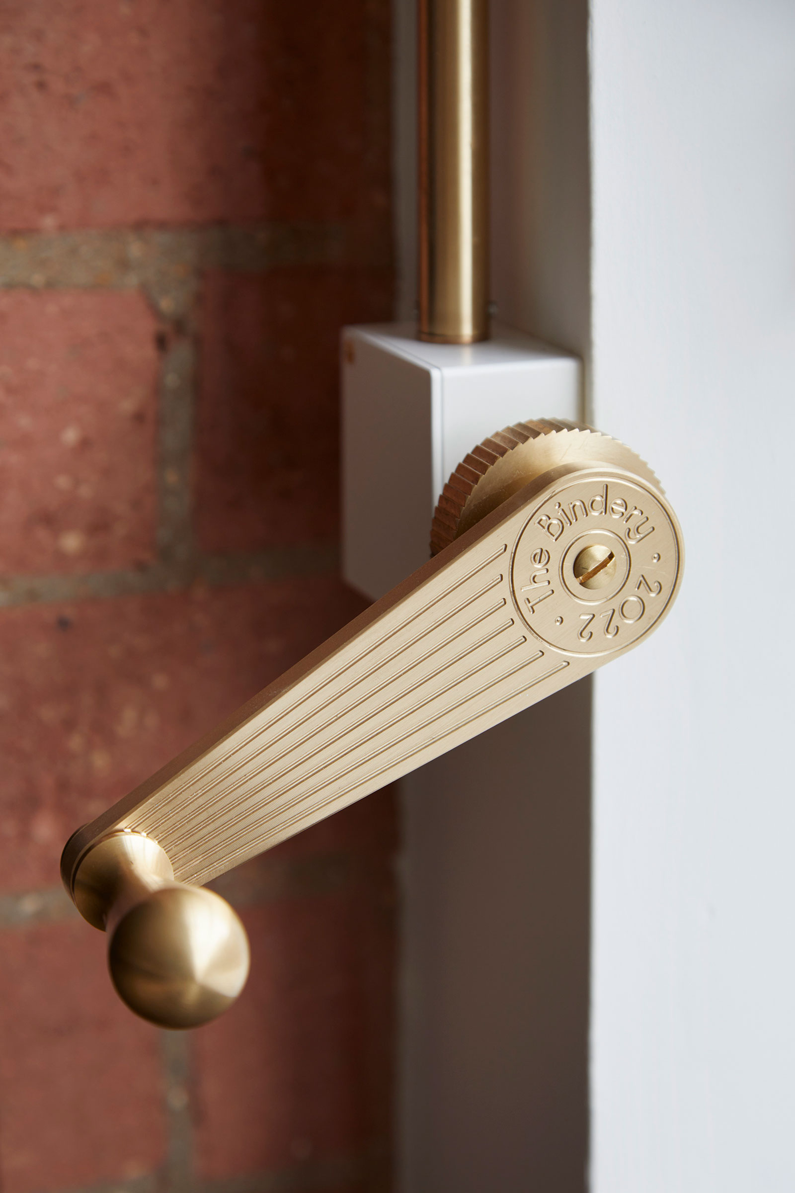
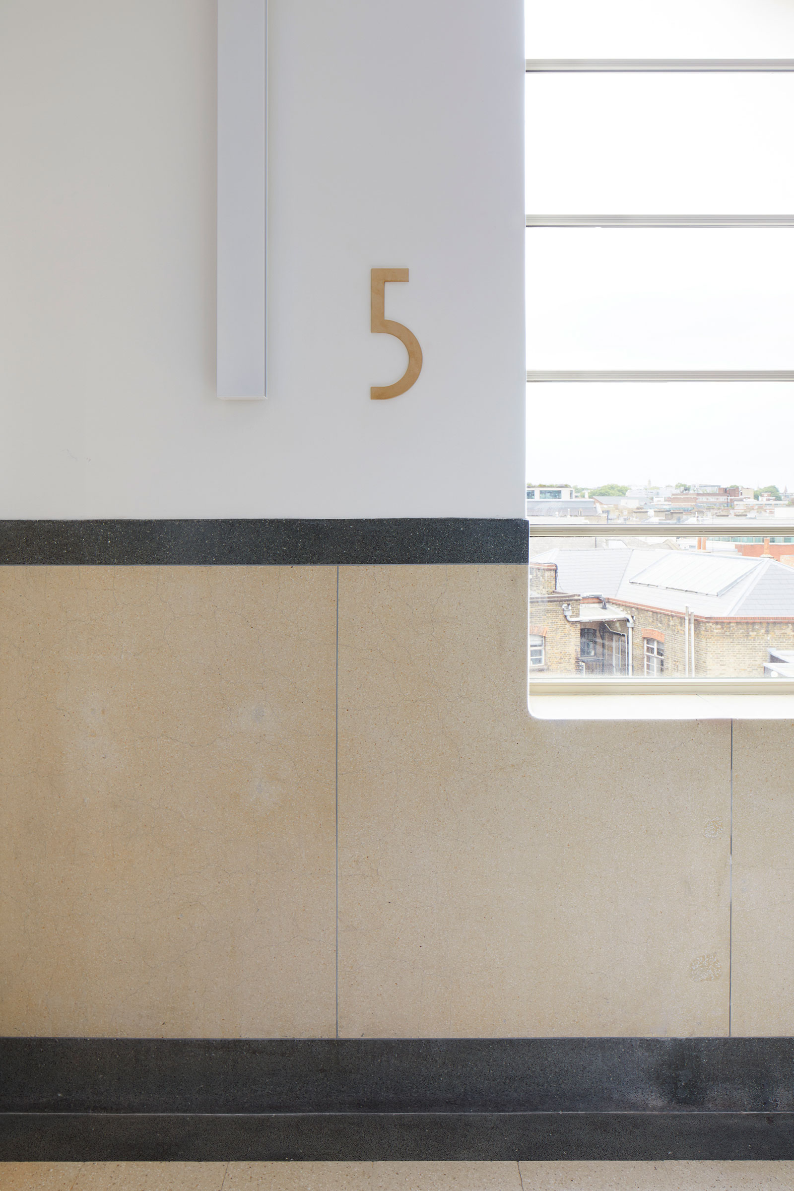
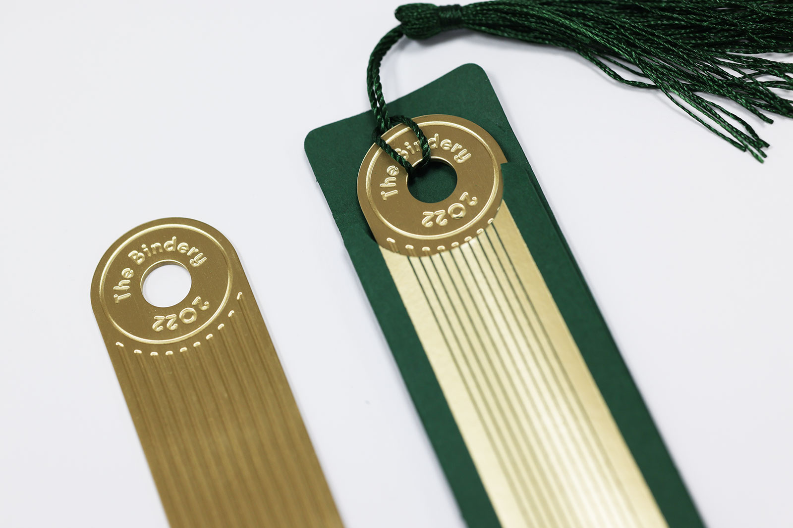
Our campaign needed to reflect the quality of the scheme from start to finish. From creating bespoke riso prints to show off the building’s style pre-completion, to designing the solid brass signage and winder handles for the crittle windows.
Our campaign needed to reflect the quality of the scheme from start to finish. From creating bespoke riso prints to show off the building’s style pre-completion, to designing the solid brass signage and winder handles for the crittle windows.
